

Smartphone screens generate over 60% of all global web traffic. Desktop search experience no longer dictates digital visibility. Google enforces mobile-first indexing universally across every indexed website on the web. Search engine crawlers evaluate your mobile layout, rendering speed, visual stability, and touch navigation as the primary baseline for organic rankings.
If your website delivers a sluggish, cluttered, or difficult mobile interface, your search visibility drops immediately. Search engine algorithms penalize sites with unreadable fonts, shifting layouts, or slow network response times. Beyond traditional search engines, modern Generative Engine Optimization (GEO) platforms like SearchGPT, Perplexity, and Google Gemini also evaluate mobile usability. AI engines parse mobile content streams to generate direct answers for voice search and mobile AI feeds.
Providing an exceptional mobile experience requires a harmony of technical precision, responsive web design, and user-centric experience planning. This comprehensive guide provides actionable strategies, technical implementations, and performance optimizations. Implementing these proven practices will help you rank higher, engage visitors effectively, and maximize mobile conversions.
Discover hidden technical errors choking your mobile rankings by exploring our in-depth guide to performing a complete SEO technical audit.
1. Architectural Foundation: Structural Configuration for Mobile SEO
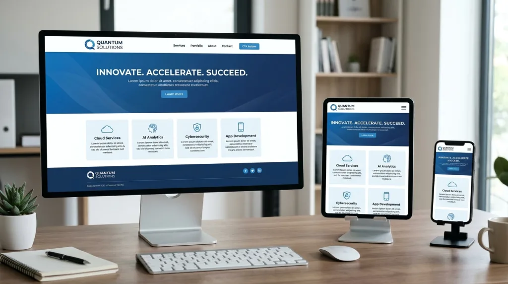
Search engine spiders use smartphone bots to evaluate web pages. Establishing an accessible technical architecture ensures crawlers index your content accurately without split authority or canonical errors.
1.1 Responsive Web Design vs. Dynamic Serving vs. Separate Mobile URLs
Selecting the correct mobile architecture determines how search engines crawl and process your website. Website owners generally choose between three distinct mobile configurations:
- Responsive Web Design (RWD): Serves identical HTML code to all devices using CSS media queries to alter layout rendering automatically.
- Dynamic Serving: Serves different HTML and CSS code on the same URL depending on the user-agent header detected by the server.
- Separate Mobile URLs (m.dot): Redirects mobile visitors to a dedicated subdomain or path (e.g.,
m.example.com) using separate HTML codebases.
Google explicitly recommends Responsive Web Design as the industry standard. Responsive design eliminates crawl fragmentation, maintains a single canonical URL structure, and prevents messy redirect chains.
[Single HTML URL] ─── (CSS Media Queries) ───► Mobile Viewport (Auto-Adapted)
                                            ───► Desktop Viewport (Auto-Adapted)
Separate mobile subdomains introduce heavy maintenance costs. Marketers frequently forget to align canonical tags, structured data, and internal links between m.dot pages and desktop equivalents. These oversights split page authority, dilute link signals, and trigger indexation conflicts in Google Search Console.
1.2 Viewport Configuration and CSS Media Queries
Responsive layouts rely heavily on the HTML viewport meta tag. This tag instructs browsers how to adjust page dimensions and scaling to fit screen widths.
HTML
<!-- Correct Responsive Viewport Meta Tag -->
<meta name="viewport" content="width=device-width, initial-scale=1.0">
Omitting this code causes mobile browsers to render web pages as if displaying on a wide desktop screen. Users must pinch, zoom, and scroll horizontally to view basic text blocks. Avoid using fixed-width layouts or setting user-scalable=no inside your viewport configuration. Disabling user scaling violates web accessibility standards (WCAG) and prevents users from zooming into images or fine print.
Utilize fluid CSS sizing rules such as percentages, viewport units (vw, vh), and CSS Grid or Flexbox containers. Set images and embedded media elements to scale dynamically:
CSS
/* Responsive Media Styling */
img, video, iframe {
  max-width: 100%;
  height: auto;
}
1.3 Ensuring Full Content Parity Across Devices
Under Google’s mobile-first indexing framework, missing mobile content means missing search index visibility. Crawlers do not reward websites that hide essential copy, headings, or media files behind mobile accordion tabs or script toggles if those elements fail to render in the DOM.
Maintain exact content parity between your desktop and mobile pages:
- Textual Copy: Keep core body text, headings ($H_1, H_2, H_3$), and key product specifications identical across device layouts.
- Meta Attributes: Ensure title tags, meta descriptions, alt attributes, and canonical tags mirror each other exactly.
- Structured Data: Implement identical JSON-LD schema markup on mobile pages as desktop views.
- Internal Linking: Ensure mobile menus and footer links contain the same internal links to prevent orphan pages.
2. Speed Performance: Core Web Vitals for Mobile Networks
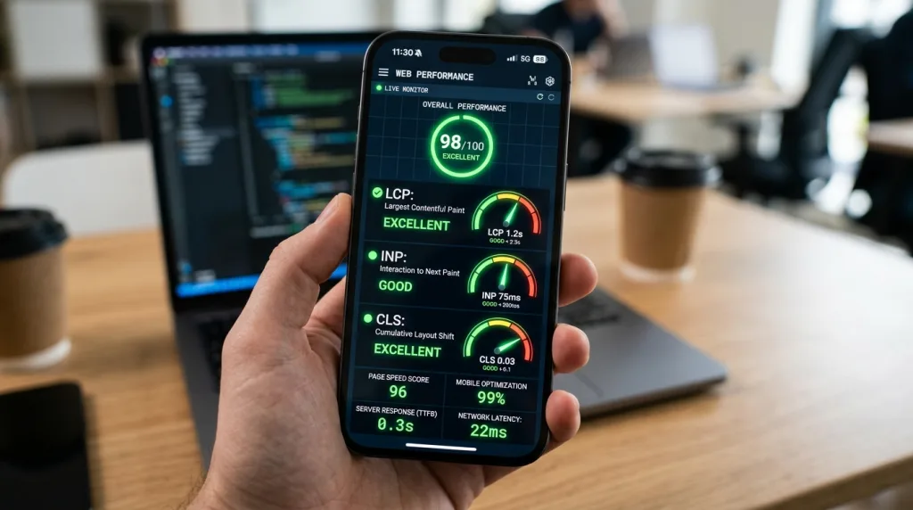
Mobile devices process code on smaller processors and connect via variable cellular networks (4G, 5G, or public Wi-Fi). Speed and rendering efficiency directly dictate search rankings and bounce rates.
┌─────────────────────────────────────────────────────────────────────────┐
│                     GOOGLE CORE WEB VITALS BENCHMARKS                   │
├──────────────────────────┬──────────────────────────┬───────────────────┤
│ Metric                   │ Targeted Ideal Range     │ Need Improvement  │
├──────────────────────────┼──────────────────────────┼───────────────────┤
│ LCP (Loading)            │ ≤ 2.5 Seconds            │ > 2.5s to 4.0s    │
│ INP (Interactivity)      │ ≤ 200 Milliseconds       │ > 200ms to 500ms  │
│ CLS (Visual Stability)   │ ≤ 0.1 Score              │ > 0.1 to 0.25     │
└──────────────────────────┴──────────────────────────┴───────────────────┘
2.1 Largest Contentful Paint (LCP) Optimization
Largest Contentful Paint measures how long a page takes to render its primary visual element within the user’s viewport. On mobile screens, LCP elements are typically hero banners, primary product images, or main headline blocks. Google demands an LCP benchmark under 2.5 seconds.
To optimize mobile LCP performance, streamline critical rendering resources:
- Prioritize the Critical Rendering Path: Preload primary hero images using
<link rel="preload" as="image" href="...">tags inside the HTML document head. - Implement Server-Side Caching & CDNs: Deploy Edge Caching and Content Delivery Networks (CDNs) to deliver cached static files from server locations closest to the mobile user.
- Eliminate Render-Blocking CSS/JS: Inline critical CSS required for above-the-fold content while deferring non-essential stylesheet files.
- Optimize Time to First Byte (TTFB): Keep server response times below 800 milliseconds by optimizing database queries and server hardware.
2.2 Interaction to Next Paint (INP) Optimization
Interaction to Next Paint evaluates overall page responsiveness by measuring the latency of every tap, click, or keypress made during a user’s session. Google considers an INP score under 200 milliseconds excellent.
Mobile processors struggle with heavy JavaScript execution. Long tasks (tasks exceeding 50 milliseconds) lock up the browser’s main thread, preventing immediate UI feedback when users tap interactive controls.
User Tap Event ──► [ Main Thread Locked by JS Task (>50ms) ] ──► Visual Feedback Delayed (High INP Penalty)
User Tap Event ──► [ Optimized Async Code / Web Worker ]     ──► Instant UI Update (<200ms Target Passed)
Reduce INP latency using these technical optimizations:
- Break Up Long JavaScript Tasks: Refactor monolithic JavaScript functions into asynchronous tasks using
requestIdleCallback()orsetTimeout()patterns. - Remove Unnecessary JavaScript Libraries: Replace heavy frameworks or third-party tracking scripts with lightweight native web APIs.
- Defer Non-Critical Scripts: Apply
asyncordeferattributes to non-essential JavaScript code blocks. - Offload Complex Calculations: Utilize Web Workers to execute heavy computational tasks on background threads.
2.3 Cumulative Layout Shift (CLS) Optimization
Cumulative Layout Shift quantifies visual stability by measuring unexpected element movements during the page rendering process. Sudden shifts cause users to miss touch targets or tap unintended links, generating severe user frustration. Aim for a mobile CLS score below 0.1.
Prevent mobile layout shifts by applying strict dimension constraints:
- Specify Image and Video Dimensions: Always set explicit
widthandheightHTML attributes on images, video elements, and embedded containers. - Use CSS aspect-ratio Properties: Reserve layout space dynamically before media assets load using modern CSS aspect ratios.
- Reserve Space for Advertisements: Wrap dynamic ad placements, cookie consent banners, and promotional elements inside fixed-size container elements.
- Optimize Web Font Loading: Use
font-display: swaporfont-display: optionalcombined with preloaded web fonts to prevent invisible text shifts (FOIT/FOUT).
2.4 Next-Generation Image Formats and Asset Delivery
Images frequently represent over 70% of total mobile page weight. Delivering uncompressed desktop-sized images over cellular networks destroys performance metrics.
Modern websites must convert legacy JPEG and PNG formats into modern, highly compressed image formats such as WebP or AVIF. These formats reduce file sizes by up to 30–50% without compromising visual clarity.
Combine modern formatting with native responsive image attributes:
HTML
<!-- Responsive WebP Image Implementation -->
<picture>
  <source srcset="hero-mobile.webp" media="(max-width: 600px)" type="image/webp">
  <source srcset="hero-desktop.webp" media="(min-width: 601px)" type="image/webp">
  <img src="hero-desktop.jpg" alt="Optimized mobile layout preview" width="800" height="450" loading="eager">
</picture>
Always enable native lazy loading (loading="lazy") for below-the-fold images and iframe elements. Never lazy-load above-the-fold hero images, as doing so introduces artificial load delays that harm LCP performance.
For comprehensive performance management, modern enterprises consult Google’s Core Web Vitals documentation to establish baseline monitoring protocols. Aligning technical optimization with robust backend infrastructure ensures fast delivery across all device sizes. High-performing websites routinely rely on structured technical strategies, such as professional enterprise SEO services, to resolve server bottlenecks and speed limitations.
Build a blazing-fast, responsive web infrastructure engineered for mobile performance using modern custom CMS development solutions tailored for growth.
3. User Experience (UX) & Conversion Rate Optimization (CRO)
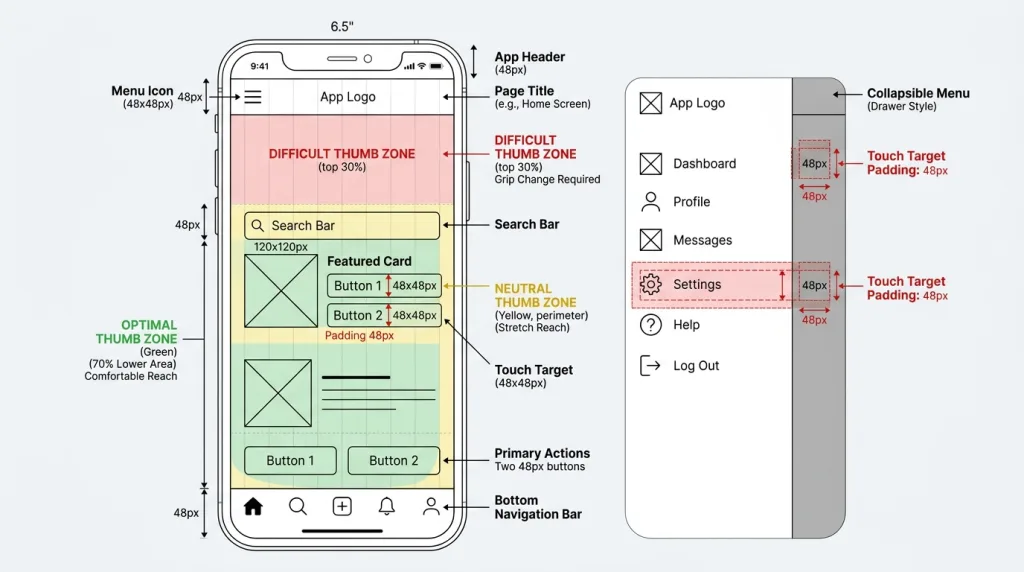
Technical speed brings users to your web pages, but intuitive user experience converts them into customer leads. Mobile UX and conversion optimization work together to keep visitors engaged while sending positive search signals to Google.
       ┌──────────────────────────────────────────────────────────┐
       │               MOBILE UX & ACCESSIBILITY PIPELINE         │
       └────────────────────────────┬─────────────────────────────┘
                                    │
    ┌───────────────────────────────┼───────────────────────────────┐
    ▼                               ▼                               ▼
Touch Target Precision       Navigation Simplicity         Clean Reading Hierarchy
(48px Min Target Size)       (Streamlined Hamburger)        (16px Font, 4.5:1 Contrast)
3.1 Touch-Friendly Navigation and Ergonomic Target Sizing
Human thumbs replace precise mouse cursors on mobile screens. Interactive elements placed too close together lead to accidental misclicks, frustrating users and driving up bounce rates.
Adhere to touch target guidelines established in the W3C Mobile Best Practices:
- Minimum Target Dimensions: Ensure primary buttons, links, and form fields measure at least 48×48 CSS pixels.
- Adequate Element Padding: Maintain a minimum 8px spacing buffer between adjacent clickable elements.
- Thumb-Zone Ergonomics: Position primary CTA buttons and mobile search bars within comfortable reaching distance of the user’s thumb (typically middle-to-lower screen regions).
- Collapsible Hamburger Menus: Simplify top navigation menus into clear, easy-to-tap collapsible drawers.
┌────────────────────────────────────────────────────────┐
│ [≡] Brand Logo                              [Search 🔍] │  Top Header Zone
├────────────────────────────────────────────────────────┤
│                                                        │
│                    MAIN SCREEN AREA                    │
│                 Primary Content & Text                 │  Neutral Viewing Zone
│                                                        │
├────────────────────────────────────────────────────────┤
│           [ ACTION BUTTON (48px Height) ]              │  Natural Thumb Reach Zone
└────────────────────────────────────────────────────────┘
3.2 Eliminating Intrusive Interstitials and Mobile Overlays
Covering content with full-screen promotional pop-ups frustrates mobile visitors trying to read text. Google explicitly penalizes web pages that employ intrusive interstitials upon landing.
  NON-COMPLIANT INTERSTITIAL                 COMPLIANT POP-UP BANNER
┌────────────────────────────┐            ┌────────────────────────────┐
│ ┌────────────────────────┐ │            │ Main Content Body Text     │
│ │ FULL-SCREEN ADS POPUP  │ │            │ Readable without blockages │
│ │ [BLOCKS ALL CONTENT]   │ │            │                            │
│ └────────────────────────┘ │            ├────────────────────────────┤
│ Main Content Hidden Below  │            │ Cookie Banner [ Accept ]   │
└────────────────────────────┘            └────────────────────────────┘
Avoid these interstitial patterns:
- Displaying full-screen pop-ups immediately after a user navigates from search results.
- Forcing users to dismiss an overlay banner before accessing the main page body.
- Utilizing layout overlays that obscure critical above-the-fold content.
Google allows specific overlay styles without imposing ranking penalties:
- Legal Mandates: Cookie consent banners, GDPR compliance notifications, and age verification gates.
- Unobtrusive Banners: Small smart app banners or inline calls-to-action that occupy less than 20% of screen area.
3.3 Mobile Typography and Visual Accessibility
Typography dictates readability on small mobile screens. Requiring users to zoom in to read body text degrades experience metrics.
Maintain strict mobile legibility standards:
- Font Size: Set a minimum base body font size of 16px to maintain clear visibility.
- Line Height: Maintain a line-height ratio between 1.5 and 1.6 to ensure proper spacing between sentences.
- Color Contrast Ratio: Comply with WCAG 2.1 AA accessibility guidelines by keeping a contrast ratio of at least 4.5:1 between text and background colors.
- Short Paragraph Blocks: Break up dense text walls into short, scannable paragraphs (2–4 sentences) interspersed with bullet lists and descriptive subheadings.
Learn how balancing organic search visibility with user conversion strategies maximizes revenues by comparing SEO vs CRO for mobile growth.
4. Technical Crawlability, JavaScript Rendering & Structured Data
Search engine bots process mobile websites in a multi-stage workflow: crawling, rendering, and indexing. Ensuring your site code executes efficiently prevents crawler drop-offs and guarantees accurate page evaluation.
Client Request ──► Server Response (HTML) ──► WRS (Web Rendering Service) ──► DOM Indexing & Ranking
4.1 Client-Side Rendering vs. Server-Side Rendering
Modern web applications built on single-page frameworks (React, Vue, Angular) often rely on Client-Side Rendering (CSR). With CSR, the initial HTML response arrives as a sparse shell, requiring JavaScript to build the full DOM inside the client browser.
While Googlebot Smartphone executes JavaScript, client-side rendering introduces rendering delays. Google defers JavaScript processing until rendering resources become available, delaying indexing for updated page content.
Implement Server-Side Rendering (SSR) or Static Site Generation (SSG) whenever possible. SSR pre-renders complete HTML content on the server, delivering fully hydrated DOM structures to Googlebot immediately on first fetch.
Ensure your robots.txt file does not accidentally block Googlebot Smartphone from accessing critical JavaScript, CSS files, or API endpoints.
# CORRECT ROBOTS.TXT CONFIGURATION FOR MOBILE CRAWLING
User-agent: Googlebot-Smartphone
Allow: /
Allow: /wp-content/uploads/
Allow: /static/css/
Allow: /static/js/
4.2 Mobile Structured Data and Schema Markup Alignment
Structured data helps search engines understand page context and surfaces rich snippet features in mobile search results. Rich snippets—such as review stars, FAQ dropdowns, product pricing, and breadcrumb trails substantially increase mobile click-through rates (CTR).
Deploy Schema.org markup using clean JSON-LD scripts embedded inside your page code:
HTML
<script type="application/ld+json">
{
  "@context": "https://schema.org",
  "@type": "Article",
  "headline": "Mobile SEO Best Practices for Higher Rankings",
  "image": ["https://example.com/images/feature-mobile-seo.webp"],
  "author": {
    "@type": "Organization",
    "name": "Vastcope"
  },
  "publisher": {
    "@type": "Organization",
    "name": "Vastcope"
  }
}
</script>
Verify that mobile pages render identical structured data attributes as desktop pages. Use Google’s Rich Results Test tool to confirm that Googlebot Smartphone detects your JSON-LD implementations correctly.
4.3 Local Mobile SEO and Intent Optimization
Over 75% of mobile searches containing local intent (e.g., “near me” or specific service queries) result in same-day physical business visits or phone calls. Capitalizing on mobile local search requires local content signals and map ecosystem optimization.
- Google Business Profile Integration: Claim, verify, and fully complete your Google Business Profile listing, ensuring exact Name, Address, and Phone number (NAP) consistency across the web.
- Geotargeted Schema: Implement
LocalBusinessstructured data specifying physical coordinates, operating hours, and service regions. - Click-to-Call Buttons: Add visible
tel:hyperlinked phone numbers on mobile headers to streamline direct customer calls.
HTML
<!-- Mobile Click-to-Call Link Example -->
<a href="tel:+18005550199" class="phone-button">Call Our Experts Now: (800) 555-0199</a>
Outperform your industry rivals on mobile search results by mastering advanced techniques for comprehensive digital SEO competitor analysis.
5. Generative Engine Optimization (GEO) for Mobile Search

Search is evolving beyond traditional blue organic links. AI platforms such as SearchGPT, Perplexity, and Google Gemini deliver direct, summarized answers to user queries on mobile screens. Generative Engine Optimization (GEO) ensures your content powers these AI answers.
                  ┌──────────────────────────────────────────────┐
                  │   GENERATIVE ENGINE OPTIMIZATION (GEO) FLOW   │
                  └──────────────────────┬───────────────────────┘
                                         │
    ┌────────────────────────────────────┼────────────────────────────────────┐
    ▼                                    ▼                                    ▼
Direct Fact Declarations        Structured Data & Lists              Entity Relationship Mapping
(Scannable Core Definitions)    (Tables, Bullets, Schemas)           (Authoritative Topic Alignment)
5.1 How AI Engines Parse Mobile Web Content
Generative engines process web pages differently than legacy keyword algorithms. AI systems scan DOM structures for concise facts, statistical proof points, authoritative definitions, and structured lists.
Mobile environments demand high information density. AI engines extract content from mobile sites that structure answers clearly without unnecessary fluff.
- Lead with Direct Declarations: Answer core search queries within the first two sentences of every major section before detailing secondary context.
- Cite Verifiable Statistics: Back up assertions with data points, industry studies, and accredited sources.
- Structure Key Takeaways: Use ordered and unordered lists to help AI models process and extract key insights.
5.2 Structuring Content for Mobile AI Overviews
To rank within Google AI Overviews and mobile voice search feeds, format content for direct extraction:
- Definition Blocks: Include short, clear definitions ($40-60$ words) directly below major $H_2$ subheadings.
- Comparison Tables: Format comparisons using clean, accessible HTML tables (
<table>) featuring descriptive header rows (<th>). - Numbered Steps: Outline technical workflows using structured
<ol>and<li>elements, giving AI scrapers clear procedural steps.
5.3 Building Mobile Entity Authority
AI models prioritize trusted content creators with strong E-E-A-T (Experience, Expertise, Authoritativeness, and Trustworthiness). Building entity authority on mobile requires clear brand association signals:
- Publish clear author bios linked to verified social profiles and industry citations.
- Secure contextual brand mentions across respected industry publications.
- Build high-quality backlink profiles that validate your domain’s subject-matter expertise.
6. Systematic Audit & Maintenance Framework for Mobile SEO
Maintaining optimal mobile search visibility requires routine monitoring and proactive technical health checks. Establishing a recurring audit routine helps identify performance degradation before it impacts organic search traffic.
┌──────────────────────────────────────────────────────────────────────────┐
│                      RECURRING MOBILE SEO AUDIT SCHEDULE                 │
├───────────────┬──────────────────────────────────┬───────────────────────┤
│ Frequency     │ Recommended Audit Tasks          │ Diagnostic Tools      │
├───────────────┼──────────────────────────────────┼───────────────────────┤
│ Weekly        │ Check Mobile Usability Errors    │ Google Search Console │
│ Monthly       │ Audit Core Web Vitals Benchmarks │ PageSpeed Insights    │
│ Quarterly     │ Complete Technical Crawl Audit   │ Screaming Frog / Site Audit │
└───────────────┴──────────────────────────────────┴───────────────────────┘
6.1 Essential Mobile Diagnostic Tools
Utilize these industry-standard diagnostic tools to audit your mobile site health:
- Google Search Console (GSC): Monitor the “Core Web Vitals” and “Mobile Usability” reports to identify URL errors, unclickable touch targets, and layout shifts.
- PageSpeed Insights: Analyze real-world field data (CrUX) and lab data to identify rendering bottlenecks and unoptimized scripts.
- Chrome DevTools (Device Mode): Test responsive breakpoints, network throttling (3G/4G simulations), and visual touch target overlays directly inside your browser.
- Google Rich Results Test: Verify that mobile JSON-LD structured data renders accurately for Googlebot Smartphone.
6.2 Routine Mobile Maintenance Checklist
Perform these technical checks to maintain top mobile rankings:
- Verify that Googlebot Smartphone crawls your site without encountering
4xxor5xxserver errors. - Inspect your
robots.txtfile to confirm critical CSS, JS, and image assets remain accessible. - Run regular URL Inspections in Search Console to review mobile rendering screenshots.
- Audit new published content to ensure desktop and mobile content parity.
- Test form submission flows, shopping cart checkouts, and CTA buttons on physical mobile devices.
Strategic Summary: Future-Proofing Mobile Search Performance
Mobile SEO is no longer an optional digital marketing channel it is the foundational baseline of modern search visibility. As Google enforces 100% mobile-first indexing and generative AI engines reshape user discovery, maintaining a fast, responsive, and user-centric mobile website is critical for business growth.
                     ┌──────────────────────────────────────┐
                     │   CORE MOBILE SEO SUCCESS PILLARS    │
                     └──────────────────┬───────────────────┘
                                        │
    ┌───────────────────┬───────────────┴───────────────┬───────────────────┐
    ▼                   ▼                               ▼                   ▼
Responsive Design   Fast Core Web Vitals            Intuitive Touch UX   Structured Data
(Fluid Viewports)   (LCP <2.5s, INP <200ms)         (No Popups, 48px)    (JSON-LD & GEO)
Focus on these essential mobile optimization priorities:
- Maintain a fully responsive, unified web architecture with absolute content parity across device viewports.
- Optimize Core Web Vitals to achieve quick load times, instant touch responsiveness, and zero layout shifts.
- Design intuitive mobile interfaces featuring large touch targets, accessible contrast, and zero intrusive pop-ups.
- Align structured JSON-LD schema across mobile pages to capture valuable rich snippets and AI answer inclusions.
Strengthen your mobile domain authority and search engine rankings with high-tier, contextual off-page signals from our specialized SEO backlink strategies.
Frequently Asked Questions (FAQs)
What is Google’s Mobile-First Indexing?
Google’s Mobile-First Indexing means Google primarily uses the mobile version of a website’s content for crawling, indexing, and ranking in search results. Googlebot Smartphone crawls web pages to evaluate page content, structured data, and performance signals, using those metrics to determine organic search rankings across both mobile and desktop searches.
How does mobile speed impact Generative Engine Optimization (GEO)?
Mobile speed directly impacts Generative Engine Optimization because AI engines prioritize fast-rendering, highly accessible DOM structures when extracting real-time information. Slow mobile pages delay crawler rendering times, increasing the likelihood that generative systems like SearchGPT or Perplexity skip your content in favor of faster, structured sources.
What is the recommended font size for mobile SEO and readability?
The baseline font size for mobile body text is 16px. Using font sizes smaller than 16px forces users to pinch and zoom on small screens, triggering mobile usability warnings in Google Search Console and degrading overall user experience.
How do intrusive pop-ups harm mobile search rankings?
Intrusive pop-ups and full-screen overlays obscure primary page content, frustrating mobile users trying to read text. Google applies algorithmic penalties to pages that display intrusive interstitials upon landing, lowering organic rankings across mobile search results.
What is the difference between Responsive Design and Dynamic Serving?
Responsive Web Design uses a single HTML codebase and URL structure, adapting page layouts dynamically using CSS media queries across different screen sizes. Dynamic Serving uses a single URL but serves entirely different HTML and CSS code blocks depending on whether the server detects a mobile or desktop user-agent header.
How does Interaction to Next Paint (INP) affect mobile user experience?
Interaction to Next Paint (INP) measures how quickly a page updates visually after a user taps a button, opens a menu, or interacts with an input field. High INP latency creates noticeable interface lag, frustrating mobile users on lower-powered devices and reducing search engine performance scores.
Why is structured data alignment critical for mobile-first indexing?
Structured data alignment ensures search engines process identical schema markup (such as JSON-LD) regardless of whether they crawl desktop or mobile viewports. If structured data is missing from mobile pages, search engines cannot grant rich snippets, reducing visibility in mobile search results.
How can I verify whether Google crawls my mobile site correctly?
You can verify mobile crawling by using the URL Inspection Tool inside Google Search Console. Input your URL, click “Test Live URL,” and review the generated screenshot and HTML code to confirm that Googlebot Smartphone renders your page elements, content, and structured data without blocking errors.
Keep reading
All articles
How Rank Brain Understands Any Keyword That You Search For
Discover how machine learning transforms vague queries into perfect results. Learn the mechanics of RankBrain and how to build a better digital…
Read article
Advanced SEO Techniques to Try Now: The Ultimate Generative Engine Optimization Framework
The landscape of search engine optimization is undergoing its most radical transformation since the introduction of RankBrain. Traditional search engines no longer…
Read article
What is Conversion Rate Optimization in Marketing? The Ultimate Guide
You pour countless hours and thousands of dollars into driving traffic to your website. You optimize your search engine rankings, run expensive…
Read article